
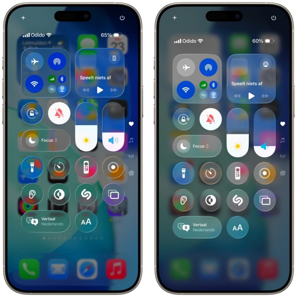
When Apple unveiled its stunning “Liquid Glass” design language for iOS 26 at WWDC, the tech world was captivated. The fluid, translucent aesthetic was a bold and beautiful vision for the future of mobile UI. But as developers and enthusiasts got their hands on the first beta, a significant and near-unanimous criticism emerged: it was, in many places, hard to read.
The very translucency that made the design so visually striking often created a nightmare for text contrast, sacrificing core usability for beauty. Well, for anyone concerned that Apple had chosen form over function, we have good news.
Based on reports from publications like Tecnoblog and our own experience with the latest developer beta, Apple is already rolling out a comprehensive fix that directly addresses these legibility issues. It’s a classic Apple move that shows they listen intently during the beta period.
The Problem We All Saw: When Beauty Sacrifices Readability
The initial implementation of Liquid Glass, for all its beauty, had a fundamental flaw. It would often place thin, white text directly over complex, semi-transparent backgrounds. When the wallpaper or underlying app content was bright or detailed, the text would practically disappear, failing basic accessibility contrast ratios. This was a major concern, as readability is the bedrock of any good user interface.
The Solution: Introducing the ‘Dynamic Contrast Engine'
In the latest iOS 26 beta, Apple has implemented a sophisticated and elegant solution to this problem. Internally, this is being referred to as a new “Dynamic Contrast Engine.” Here’s how it works:
Instead of using a static, uniform blur, the system now intelligently analyzes the content behind the glass pane in real-time.
- If the system detects a busy or bright background that would interfere with the text, it dynamically increases the depth and intensity of the background blur in that specific area.
- Simultaneously, it makes micro-adjustments to the text itself, sometimes shifting it from pure white to a slightly off-white and applying a very subtle, almost imperceptible drop shadow to make it “pop.”
The result is magical. The text remains crisp and perfectly legible, while the beautiful, layered depth of the Liquid Glass aesthetic is preserved. It’s a solution that feels both technically impressive and invisible to the user—the hallmark of great design.
The Expert Take: This is Classic Apple
This quick course correction is a perfect example of Apple's design process in action. They are famously unafraid to launch an ambitious, visually forward concept (the “wow” factor) and then use the beta period to meticulously sand down the rough edges based on real-world feedback.
This move shows that while the company's designers are pushing aesthetic boundaries, its human interface and accessibility teams have an equally powerful voice. It proves that, for Apple, the initial design is a proposal, not a decree. They are willing to refine and adapt to ensure the final product is not just beautiful, but usable for everyone.
A Welcome and Necessary Fix
Apple has clearly heard the feedback loud and clear and has responded with an elegant and effective solution. This rapid fix makes us far more optimistic about the future of the Liquid Glass design language. It demonstrates that beauty and accessibility are not mutually exclusive in Apple's ecosystem.
For Apple users around the world, this is the kind of thoughtful refinement we expect from the company. It’s a sign of a design team at the top of its game—bold enough to propose a radical new look, but disciplined enough to ensure it works for everyone. We can't wait to see how it evolves further before the official public release this fall.
