


If you got a weird sense of déjà vu watching Apple’s latest WWDC keynote, you’re not alone. As Apple unveiled its “once-in-a-decade” software redesign for iOS, iPadOS, and macOS, a single thought echoed across the tech world: “Wait a minute… I’ve seen this before.”
The new design language, dubbed “Liquid Glass,” is a stunning showcase of translucent menus, glossy icons, and refractive materials. It’s beautiful, it’s futuristic, and it’s also a dead ringer for the “Aero” theme from Microsoft’s most infamous operating system: Windows Vista.
The irony is almost too perfect. Apple, the titan of design, appears to be resurrecting the ghost of a product remembered as a slow, bloated failure. So, is this a monumental misstep? Or is Apple about to succeed where Microsoft so spectacularly failed? Let’s break it down.
Meet “Liquid Glass”: Apple’s Shiny New Vision
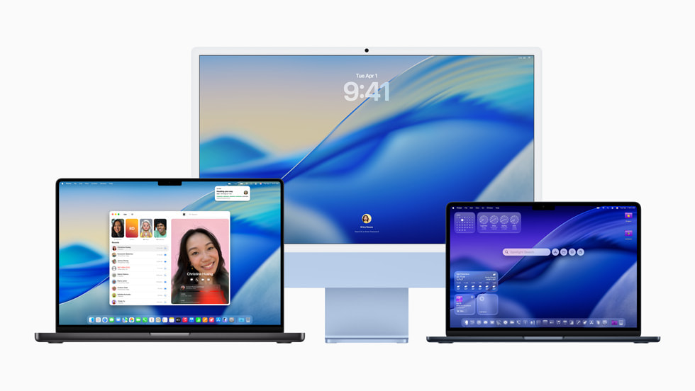
First, let’s look at what Apple is actually doing. Inspired by the 3D environment of the Vision Pro, Liquid Glass is a sophisticated material that dynamically reacts to light and movement. It’s not just simple transparency; it’s a complex, real-time rendering effect that makes buttons, sliders, and sidebars feel more tangible.
This isn’t a minor tweak. It’s a complete overhaul affecting everything from the Control Center on your iPhone to the app windows on your Mac. The goal is clear: create a single, cohesive design language that bridges the gap between your 2D phone screen and the 3D world of spatial computing.


Déjà Vu, Anyone? The Unmistakable Echo of Aero
Now, let’s rewind to 2007. Windows Vista’s “Aero” theme was built on the exact same principles: translucent window frames, glossy effects, and a sense of depth. The visual parallels between Liquid Glass and Aero are undeniable, from the jewel-like icons to the transparent menus.
This revival taps directly into a growing nostalgia for the “Frutiger Aero” aesthetic of the mid-2000s—a design trend celebrated for being more optimistic and human than the flat, minimalist designs that followed. Apple’s new look feels both futuristic and strangely familiar, a retro-futurist vision that is suddenly back in style.
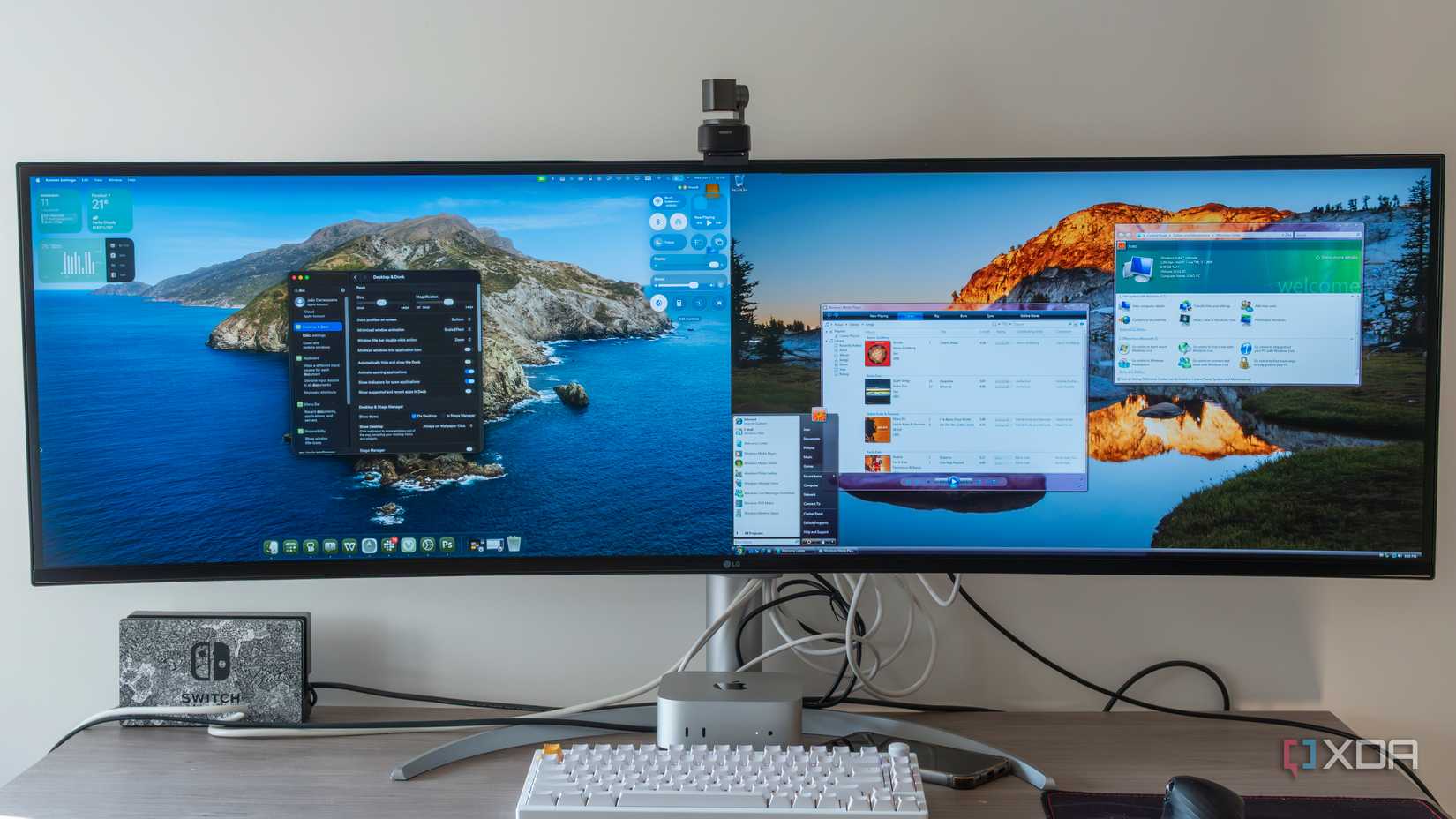
(Placeholder for a comparison image showing Liquid Glass next to Windows Vista Aero. Credit: XDA-Developers)

So, Why Did We All Hate Vista?
If the aesthetic is so similar, why was Vista such a disaster? In one word: performance.
The Aero theme was a resource hog. In 2007, most consumer PCs, especially budget laptops, simply didn’t have the graphical horsepower to handle rendering blurred glass in real-time. The result was a sluggish, stuttering nightmare that made brand-new computers feel slower than the old ones they replaced. It was a classic case of ambition outstripping the available technology. Microsoft designed an OS for hardware that wasn’t mainstream yet, and it had no control over the underpowered machines its partners were selling.
Why Apple Can Actually Pull This Off
This is where Apple has the ultimate trump card: vertical integration.
- The Apple Silicon Superpower: Unlike Microsoft, Apple designs the hardware and the software to work in perfect harmony. The M-series and A-series chips are custom-built with powerful, efficient GPUs that can handle Liquid Glass without breaking a sweat. The performance bottlenecks that killed Vista simply don’t exist in Apple’s closed ecosystem.
- It’s an Evolution, Not a Revolution: Apple has been slowly re-introducing glassy elements for years, from the iOS 7 Control Center to the sidebars in macOS Big Sur. For users, this feels like a natural progression, not a jarring change.
- The Security Advantage: The parallels even extend to desktop “Gadgets” (Vista) vs. “Widgets” (macOS). Vista’s Gadgets were a security nightmare, so full of holes that Microsoft eventually told everyone to disable them. Apple’s Widgets, by contrast, are built on a modern, sandboxed architecture that is secure from the ground up. It’s another example of Apple learning from the past.
But Are There Cracks in the Glass?
Despite its advantages, Apple’s new design isn’t without criticism, even in its early beta stage. The biggest concern is accessibility.
In some areas, like the new iOS Control Center, the glass effect is so transparent that it can make text and icons incredibly difficult to read against certain backgrounds. This is a major legibility issue that Vista’s Aero, for all its flaws, actually handled better by using a stronger blur. While Apple will likely fine-tune this before the public release, it’s a reminder that a beautiful design is useless if it’s not functional.
Apple isn’t just copying a failed idea; it’s attempting its redemption. It’s realizing a design dream from nearly two decades ago, but with the technology and control to finally do it right.
This marks a major swing of the pendulum away from the flat design that has dominated our screens for a decade, back toward a richer, more dimensional interface. Apple has proven it can make glass perform; now it just has to prove it can make it work for everyone.


